All Eyes on Microsofts New Logo
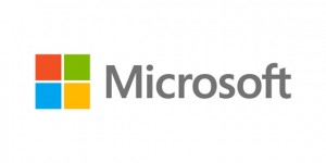
Computer software and hardware giant Microsoft has changed its logo for the first time in 25 years.
This news comes a few days after Apple overtook the company as the most valuable company in America by stock market valuation.
Here’s how theverge.com reported the event.
Microsoft has just unveiled a new look and feel to its corporate logo. Following 25 years from its former iteration, this is the first major Microsoft logo change in the company’s history. The new logo includes a multicolored symbol that’s typically found on thecompany’s Windows products — the first time the wordmark has been accompanied by an image. Speaking to The Seattle Times, Microsoft’s Jeff Hansen reveals that the new logo is designed to “signal the heritage but also signal the future — a newness and freshness.”
Microsoft is preparing to launch a range of products this holiday season, including its Windows 8 and Windows Phone 8 operating systems and a new Surface tablet. The software giant’s new logo reflects a change in the company’s branding that has been triggered by the new look Windows 8 interface and branding. Microsoft’s Office team has also adopted a similar interface and style, and Windows Phone 8 completes the trio of products for Microsoft’s major rebrand this fall.
The new logo will take time to filter across the company’s products, Hansen says “there may be other instances where you will see the old logo being used for some time.” Overall the new symbol is “important in a world of digital motion” says Hansen, one that the company is “excited about” using.
Source: theverge.com


